Overview:
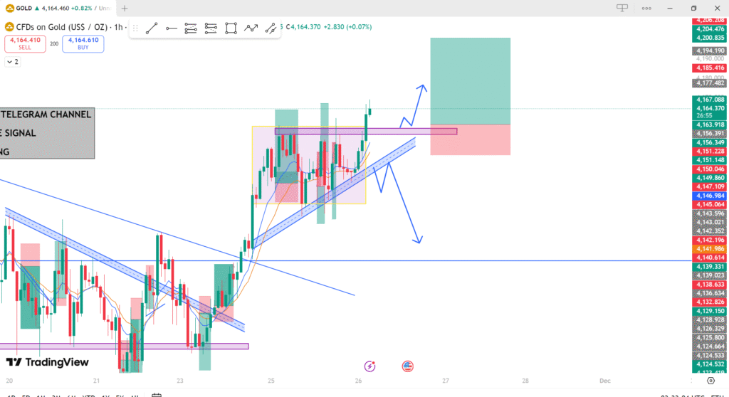
This chart tracks the price movement of gold (XAU/USD) on a 1-hour timeframe. It includes key technical indicators, trendlines, and price levels to predict potential future price action.
Key Elements:
1. Trendlines:
- Blue Upward Trendline: This line represents the overall bullish (upward) trend in the gold market. Price has been following this trendline, moving higher over the last few days. It shows that the buyers are in control, and the price has been respecting this trend as support.
2. Support and Resistance Zones:
- Purple Horizontal Support Zone: The purple horizontal line at the bottom of the chart indicates a key support level where price previously reversed upward. This support level is crucial as it could provide a strong foundation for price to bounce higher again if it retraces.
- Yellow Zones: The yellow highlighted boxes indicate areas of consolidation or previous price ranges where the market was uncertain, moving sideways. These areas are significant because they often act as resistance or support levels in the future. In the chart, the yellow boxes are suggesting a potential area of resistance near the current price level.
- Red Zone (Potential Resistance): The area marked in red is identified as a possible resistance zone, where price might face difficulty moving higher. If the price reaches this zone, there could be a reversal or pullback in price.
- Green Zone (Potential Support): The green highlighted box suggests a possible support level. If price drops to this level, there might be a chance for a bullish bounce.
3. Moving Averages:
- The orange and yellow moving averages show short-term trends. When the price is above these lines, it indicates bullish momentum. Conversely, when the price is below them, it signals bearish momentum.
4. Candlestick Patterns:
- The candlesticks themselves show the actual price action. We see a mixture of bullish (green) and bearish (red) candles, which suggest that price is moving in a volatile but upward direction.
5. Price Projection (Arrows):
- Blue Arrows (Bullish Projection): The blue arrows pointing upward indicate the potential continuation of the uptrend. These arrows suggest that the price could continue higher towards the next target or resistance level. The trader expects a bullish continuation toward higher prices.
- Red Arrows (Bearish Projection): The red arrows point downward and indicate that there is a possibility of a price retracement or reversal. If the price fails to break through the resistance zone, it may pull back to test the support level again before continuing its upward trajectory.
6. Telegram Channel Signal:
- The chart mentions a Telegram channel providing trading signals. This implies that the chart is likely used for educational or real-time trade alerts, where traders are being advised when to enter or exit positions based on the current analysis.
Trading Strategy & Analysis:
- Bullish Scenario:
- If the price successfully breaks above the resistance zone (red box) and continues moving higher, traders might look for an opportunity to buy as the price could continue to rise, targeting higher levels indicated by the blue arrows.
- The bullish trendline provides support, so even if there is a minor pullback, the price might find support along the trendline and resume moving upward.
- Bearish Scenario:
- If the price fails to break above the resistance and starts to reverse, selling near the red zone could be an option. The price may retrace down to test the support levels (purple zone).
- If the price breaks below the support levels and the trendline, this could signal a more significant bearish trend.
- Consolidation Zone:
- The yellow boxes represent areas where price has been moving sideways. These are typically periods of indecision in the market, where neither the buyers nor sellers are in control. A breakout from this consolidation area can provide clear direction for the next move, either bullish or bearish.
Key Takeaways:
- The chart shows a bullish bias, but traders should watch the red resistance zone and support levels for potential breakouts or pullbacks.
- The trendline and moving averages suggest that the overall market sentiment is still bullish, but caution is needed as price approaches potential resistance.
- Monitor price action around key levels for better entry or exit decisions.
