Chart Analysis (BTC/USD)
1. Price Structure
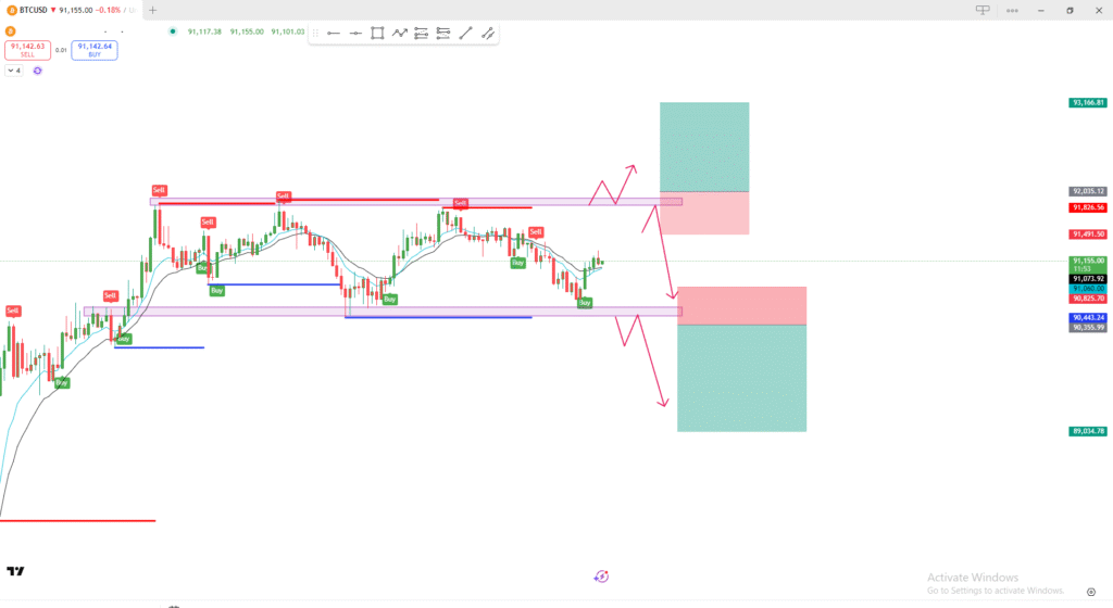
- The chart shows Bitcoin moving inside a horizontal range.
- Resistance zone (Top): Red area near the previous highs.
- Support zone (Bottom): Purple/blue area near the previous lows.
Price is currently in the middle of the range, not at an extreme.
2. Potential Scenarios (Shown by Pink Arrows)
🔼 Bullish Scenario
- Price moves upward toward the upper resistance zone.
- A false breakout / liquidity grab may happen above resistance.
- After that:
- Either price breaks above and continues higher (long setup area shown in green).
- Or it rejects and falls back into the range.
The large green box above is the long take-profit zone if a breakout occurs.
🔽 Bearish Scenario
- Price drops to the support zone at the bottom.
- A liquidity sweep may happen under support.
- After that:
- Price either breaks down, leading to the big downside target (large green box below).
- Or it rejects upward and returns into the range.
The red box below marks the sell zone / stop-loss area if the breakdown fails.
3. Indicators
- The chart includes Buy/Sell signals from an indicator.
- Price is hovering around the moving averages, meaning no strong trend yet—this confirms range conditions.
4. Summary
- Bitcoin is consolidating inside a clear range.
- Key zones:
- Resistance: where a breakout or rejection could happen.
- Support: where a breakdown or bounce could occur.
- You are planning two possible trades:
- Breakout long above resistance.
- Breakdown short below support.
Right now, the market is neutral and waiting for direction.
