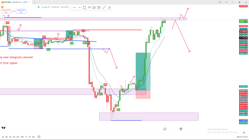
📊 Market Structure Analysis
1. Price Trend
- The market has recently made a strong bullish move upward, shown by the large green candles and the breakout above previous consolidation.
- EMAs (blue + black lines) are sloping upward, confirming short-term bullish momentum.
🔵 Key Zones (Support & Resistance)
1. Major Resistance Zone
- Price is currently inside a strong resistance zone (highlighted in purple at the top).
- This level previously caused multiple rejections.
- The red arrows indicate two possible reactions:
- Bullish scenario: Break and retest → continuation upward.
- Bearish scenario: Rejection → downward move back to lower support.
2. Mid-range Support Zone
- The purple zone in the middle acted as a demand area, creating the rise you see now.
- Strong bullish engulfing candles formed here → buyers are active.
3. Lower Support Zone
- The large purple box at the bottom shows a major demand zone where price previously reversed sharply.
📈 Bullish Scenario (If price breaks above resistance)
If candles close above the top purple zone:
- Expect a pullback to retest the broken resistance.
- If the retest holds → trend continuation upward.
- Your arrow drawing shows this correctly.
📉 Bearish Scenario (If price gets rejected)
If price fails to break above:
- Expect a decline back to:
- First support: mid purple zone
- If broken → deeper correction toward the lower demand zone
The downward arrows on the chart reflect this scenario.
📝 Summary
- Market bias right now: Bullish, but approaching strong resistance.
- Two critical reactions to watch:
- Breakout = continuation up
- Rejection = drop to support
This is a classic liquidity + supply/demand setup.
