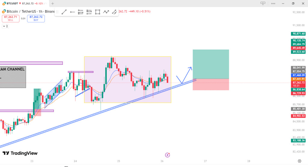
Bitcoin’s price (BTC/USDT) on the 1-hour timeframe. Here’s an analysis of the chart:
- Price Trend:
- The chart shows an upward trend with support from the blue trend line, which suggests that the price has been in a bullish move.
- Support & Resistance:
- There is a horizontal resistance level marked by the purple boxes near the top, which the price has approached but not yet broken through.
- The yellow box highlights a consolidation or a minor pullback, indicating that the price might be building up for a breakout.
- Price Targets:
- The analysis includes a target range for the price movement. The green box shows a potential area of upside (bullish target), while the red box shows a potential downside (bearish target).
- Moving Averages:
- The chart includes moving averages (the blue and orange lines). The blue line appears to be a longer-term moving average, and the orange line might be a shorter-term moving average. When the shorter-term moving average crosses above the longer-term one, it could indicate bullish momentum, and vice versa.
- Trend Channel:
- The blue trend channel suggests that the price is currently moving within a set range, with the possibility of breaking above or below it depending on further market action.
- Potential Breakout:
- The analysis seems to be anticipating a breakout above the resistance, as indicated by the potential upward movement after the consolidation. If the price breaks the resistance near 87,500–88,000, it could move toward higher levels.
