Chart Analysis (English)
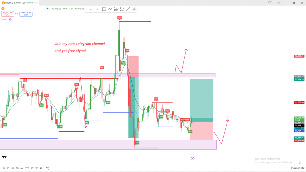
The image shows a BTC/USD price chart with various marked zones, trade labels, and projected arrows. Here’s a breakdown of what is visible:
1. Key Support & Resistance Zones
- Upper purple zone: This appears to act as a major resistance area where price previously reversed after several “Sell” labels.
- Lower purple zone: Functions as a strong support zone, with multiple “Buy” labels and price bounces.
2. Trade Labels
- The chart includes automatic or manual signals such as “Buy,” “Sell,” and “Buy Wick.”
- These likely indicate previous entries or signals generated by a trading indicator.
3. Price Behavior
- There is a clear downward move from the upper resistance zone into the lower support zone.
- After touching support, price appears to be consolidating and trying to push upward again.
4. Projections (Pink Arrows)
The pink arrows on the chart suggest:
- A possible bullish scenario: price rising from support and retesting the higher resistance zone.
- Another arrow shows potential retracement and upward continuation, implying expectations of upward momentum.
5. Risk/Reward Box
- A green/red box indicates a recent long (buy) trade setup, with:
- Green area = target zone (take profit)
- Red area = risk zone (stop loss)
6. Additional Notes
- Text on the chart advertises a Telegram channel offering signals, which is a personal promotional message and not part of the technical analysis.
- Several moving averages (likely short-term) are plotted, showing short-term trend shifts.
